INEOMEX
Mexico City
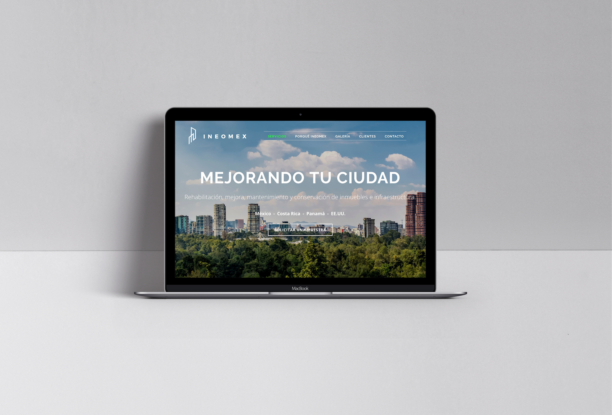
Re-branding for a company specialized in the rehabilitation, improvement, maintenance and conservation of real estate and infrastructure.
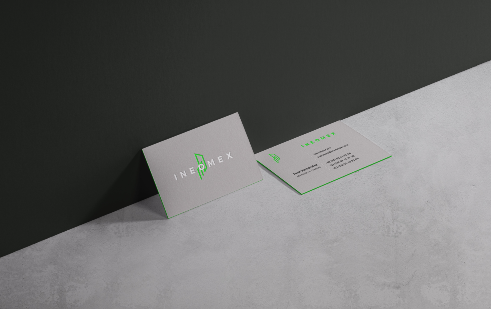
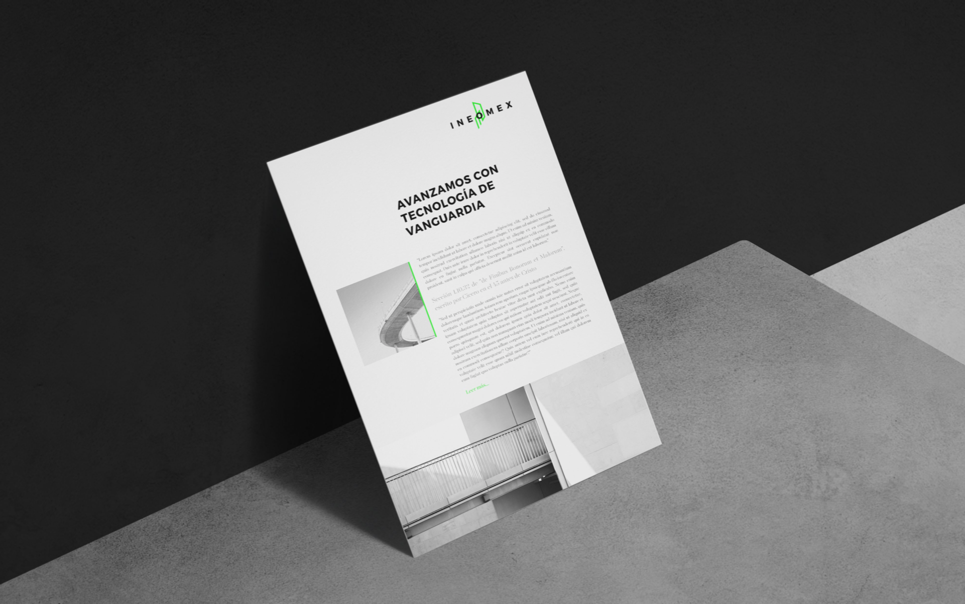
INEOMEX previous logo presented an outdated look with the use of a water drop gradient icon, small caps and a long and very small subtitle that was hard to read when rescaled. Their new image presents an innovative abstract icon inspired on the merge of skycrapers and historic buildings. Clean caps that bring formality, and the use of a brighter green color as the only element of continuity from their past identity.
SERVICES
Rebranding